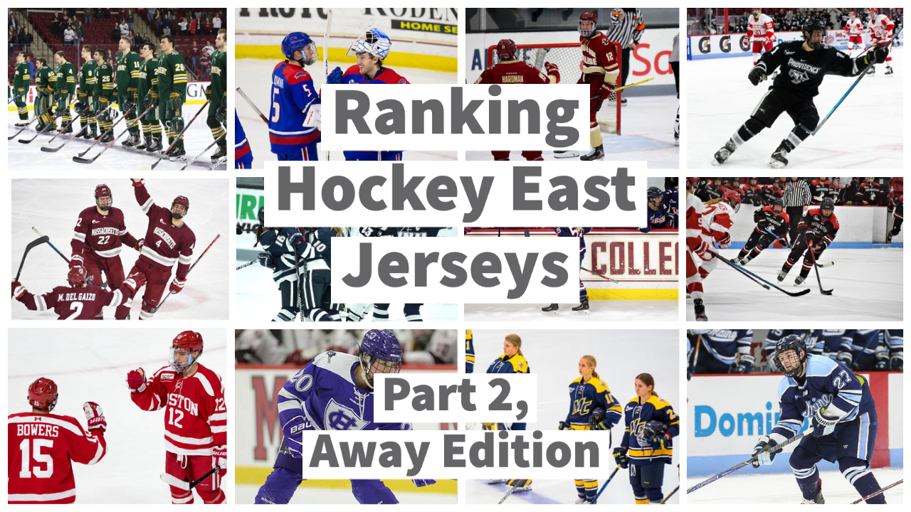
Gardner: Ranking Hockey East Jerseys: Part 2 — Away Edition
By: Brady Gardner
Yesterday, I ranked every home jersey in Hockey East — be sure to check out that article if you haven’t already — and today, I’m back for more. Buckle up, folks, ‘cause this is where it really gets good. Hockey East has a great collection of away jerseys, gracing every road trip with their vibrant colors and sharp designs. Just like I did with the home uniforms, I’ll be ranking them completely based on looks. Let’s get into it!
Disclaimer: Like I said last time, I know some schools have differences in their men’s jerseys and women’s jerseys. I did my best to pick the best example for each school’s current look.
#12 New Hampshire
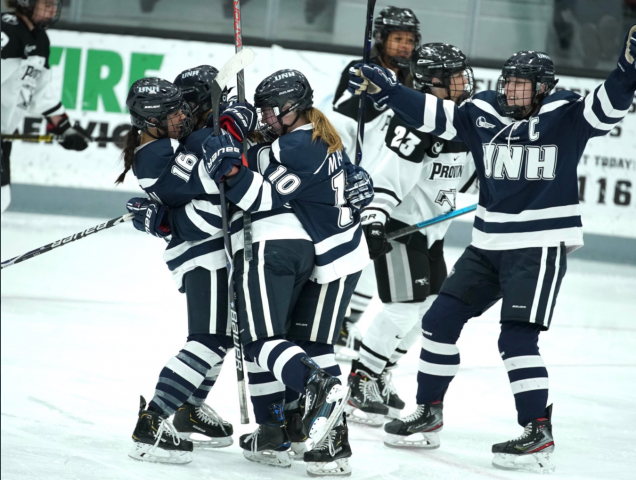
Once again, I have a tough time getting excited about anything UNH offers here. The stripes are all the same size, the two-color format is bland, and the UNH letters on the chest aren’t anything special either. I’d love to give points for simplicity, but that’s not really what we’re looking for.
#11 Holy Cross
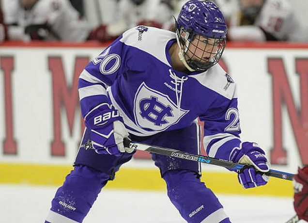
In my home jersey evaluation for Holy Cross, I raved about how well the purple was woven into the white background. This is why. Purple is such a tough color to use as a base, and the uninteresting white stripes and shoulders don’t help it much. At least they used a decent logo!
#10 UMass
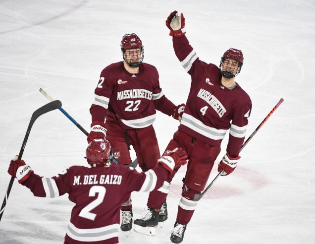
Bleh. Maybe it’s the lighting here but this dark shade of red or purple or whatever is just too ugly to be used this much. On the other end of the spectrum, the bright white and light gray almost stick out too much, especially with how big those stripes are. It’s not terrible, but it’s not good.
#9 UConn
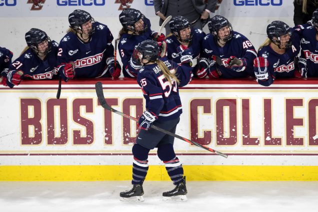
This is one of those instances where a school’s men’s and women’s away jerseys are different, but I like the women’s road uniforms better, so I’ll go off that one. This very basic pattern only works because of the strong color contrast, and I think they could still do more on the front.
#8 Vermont
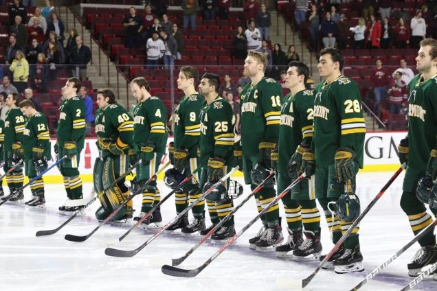
Dark green isn’t a very popular color across North American hockey, but I think Vermont pulls it off. There’s just a little too much of it for my liking, but I do love the contrast of the yellow and white stripes and lettering. Give it a little more flair, and I think this jersey could be great.
#7 UMass Lowell
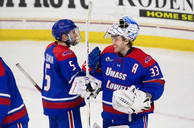
Once again UMass Lowell is right in the middle of the pack, which is fitting for a pretty average jersey. I don’t like the “UMass Lowell” on the chest and the limited use of stripes, but the borders of red on the top and bottom look good. The bright colors bail out an otherwise-boring look.
#6 Boston College
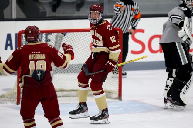
This is a tough one to grade, because I like the general idea and the diversity of the stripes, but they really lose me with the heavy use of tan — and you can’t possibly tell me that’s gold. Also, those stars above the nameplate to celebrate their national championships? Too corny for me.
#5 Providence
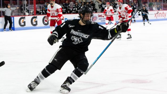
There’s just something satisfying about an all-black jersey. It’s lazy, of course, but it works. There are minimal stripes, but the usage of white and gray is still effective, and I appreciate the name and the logo stacked together. There’s a ceiling with a black-out, but this is good.
#4 Boston University
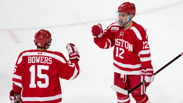
BU’s away jersey is literally the exact same scheme as their home jersey, just with the colors reversed. And somehow, I like their road look a lot more… Riddle me that one. Regardless, I think this shade of red (scarlet?) shines, and the white offers a simple but smooth distinction.
#3 Northeastern
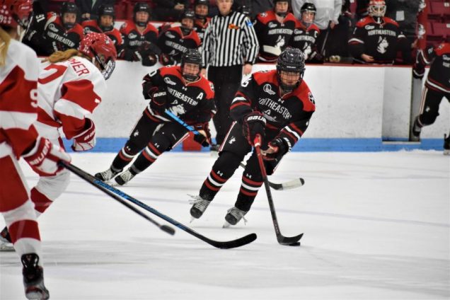
Here’s another school where the men’s and women’s away jerseys differ, but again, I’ll give them the benefit of the doubt and take my favorite. The chest layout is strong as always, and I especially like the use of red on the stripes and shoulders, adding some flair to a dark base
#2 Merrimack
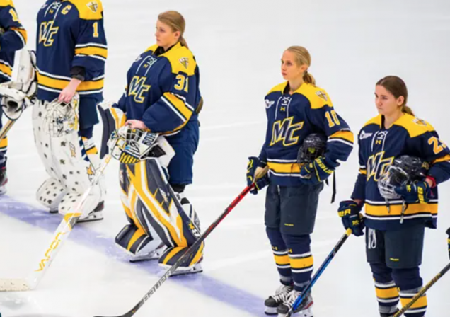
I will say, this one snuck up on me a little. I didn’t think Merrimack would be this high on my list, but I see very little to complain about here. The flashes of yellow and white pop against the navy background, and the MC logo fits the scheme. Also, those goalie pads on 31 are immaculate.
#1 Maine
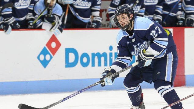
Here it is, folks; Potentially the greatest jersey in college hockey. The colors are elite, but the design really makes it all come together, from the balance of the blues to the varied thickness of the stripes. The timeless cursive font across the chest completes a masterpiece of a uniform.