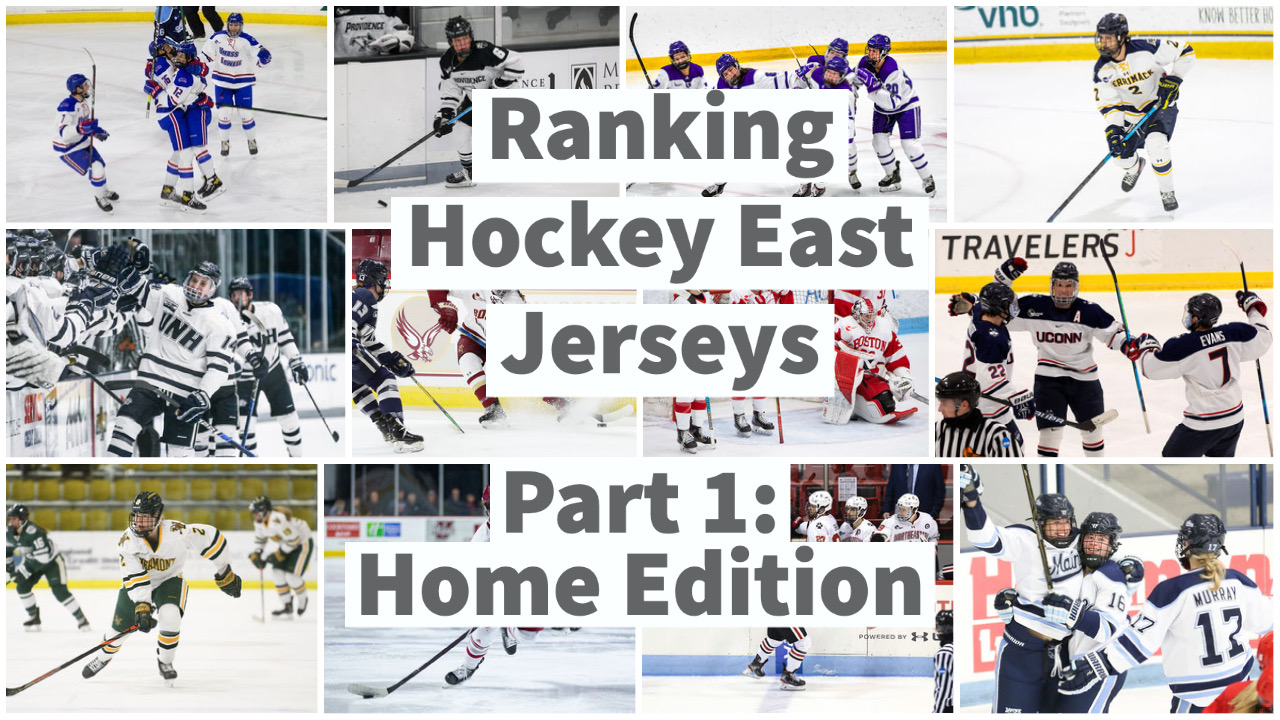
Gardner: Ranking Hockey East Jerseys: Part 1 – Home Edition
By Brady Gardner
Hockey jerseys are simply the best. Whether they’re based on traditional styles or developed from ambitious designs, there’s so much variety, so much creativity, and just so much to like about any given sweater from any given team.
Hockey East certainly plays its part in the depth of great jerseys across the hockey landscape. This conference has a wide range of jerseys to make any fan happy, from timeless classics to modern adaptations. This collection rivals any league, anywhere.
One of the best (and maybe worst) things about having so many great jerseys is that everyone has an opinion. What’s your favorite? What’s your least favorite? I have my picks, and I’m sure you’ll have yours as you go through this article.
Just like when I ranked NFL stadiums and Hockey East arenas, I will be basing my selections around looks and looks alone. No history, no biases, no nothing. These lists are based on how the uniforms look, and that’s it.
My first installment of this three-part series will center around home jerseys of the twelve Hockey East member institutions, covering both the men’s and women’s conferences. Next time I’ll look at their away jerseys, and the series will conclude with the alternate jerseys.
Disclaimer: I understand that some schools have differences in their men’s jerseys and women’s jerseys, but I did my best to pick example images that best represent each school’s current look.
That’s enough talking. Let’s start ranking!
#12 UConn
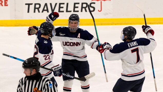
My dad’s beer league team has better jerseys than this. The red accents are promising, but they’re ruined by the bland white and solid-colored shoulders and pants. Plus, they have much better logos than that UConn lettering. No wonder they wear their alternates at home so often.
#11 New Hampshire

As you’ll notice in each ranking, UNH’s jerseys bore me. The two-color scheme doesn’t help the elementary two-stripe design, and the basic “UNH” across the chest only makes matters worse. Combined with the iffy broadcast lighting at Whittemore Center, it’s a below-average look.
#10 UMass Lowell
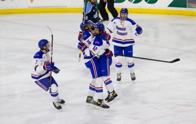
There’s just something that feels a little outdated about these River Hawk jerseys. The colors definitely pop, but the design is about as middle-of-the-road as it gets. From the shoulders to the socks, it’s missing something to me. This applies to the “UMass Lowell” on the chest as well.
#9 Boston University
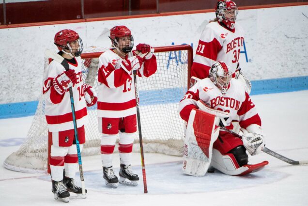
Evaluating BU’s home uniform is really testing my ability to ignore the history and focus solely on the visuals. It’s so iconic, but unfortunately, that doesn’t make it a good jersey. The thick-striped, two-color look is a bit too minimalistic for my taste. Sorry, fellow Terriers.
#8 Vermont
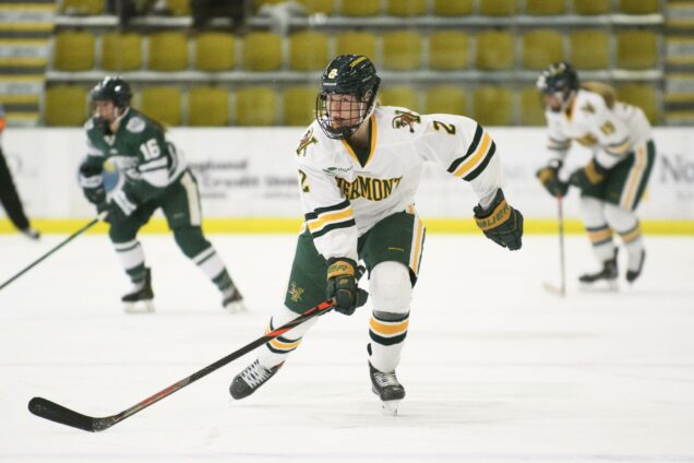
I love the UVM color combo, but they could’ve done a lot more with it than this. The all-white tops could use more yellow and green, and though I appreciate how the Vermont wording sticks out, I wish they used their Catamount “V” logo. There’s room for improvement here for sure.
#7 Providence
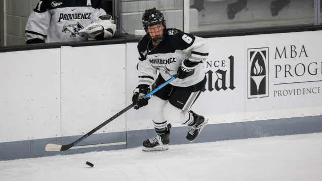
I like that both the name and the logo are on the chest of this jersey, and I like the varied colors and thickness of the stripes. However, there’s a ceiling for how good you can look in white, black and gray, and the Schneider Arena broadcast lighting doesn’t do them any favors.
#6 UMass
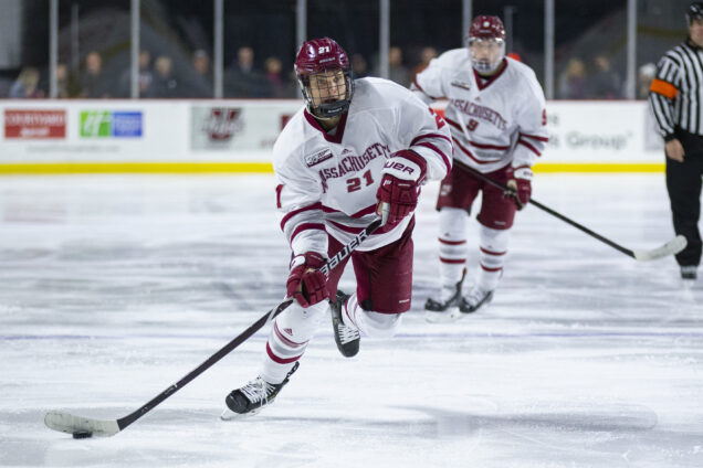
This jersey is the epitome of “like it, don’t love it”. The maroon of the letters and the white of the base are rounded out well with the clean stripes of maroon and gray. Below the underwhelming solid-colored pants, the socks go back to the theme from the top. Overall, it’s a good jersey.
#5 Maine
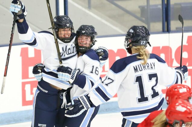
Maine is undoubtedly the beneficiary of a glorious color scheme, and you’ll see that will factor in plenty throughout these rankings. Their home jerseys aren’t their strongest, but they’re still great. The cursive “Maine” and clean stretches of blue enhance a fairly straightforward design.
#4 Merrimack
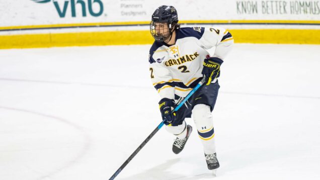
Remember Vermont’s jersey? This is more like what I wish the Catamounts did. You know where I stand on having a name across the front, but at least the number is there too, and the mix of thick and thin stripes presents a little more visual interest. It’s a safe but strong design.
#3 Boston College
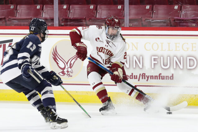
BC really toes the line between too much white and the right amount, but I think they got it right. The Boston College wordmark fills the chest nicely, and the uses of maroon and gold add a little flair across the uniform. Give the Eagles bonus points for matching the sleeves with the socks.
#2 Holy Cross
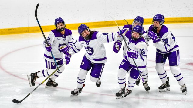
Well done, Holy Cross. Purple isn’t an easy color to work into a primarily-white uniform, but this balance of purple and white is perfectly executed with some solids and some stripes. They also used a real logo on the chest, rather than just their name! The Crusaders nailed this one.
#1 Northeastern
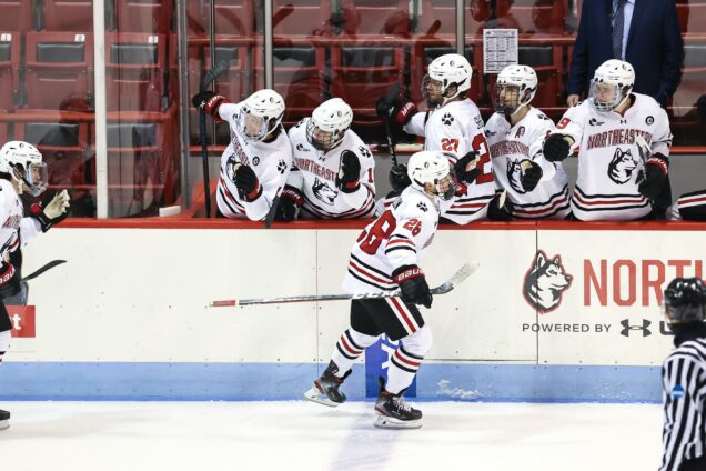
I have witnessed multiple BU heartbreaks at the hands of Northeastern in these uniforms, and yet, I still love them. There’s plenty going on with the three-stripe format, but it’s not overwhelming. They even have both their name and their logo on the chest! This is a home run.
Whether you agree or disagree, be sure to let me know your thoughts on these rankings on Twitter, @BradyDGardner. Be sure to come back tomorrow for the next installment of this series, taking a look at away jerseys! Spoiler alert: It only gets better from here.