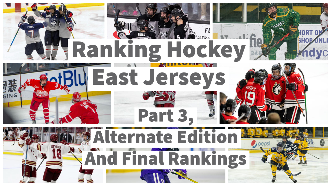
Gardner: Ranking Hockey East Jerseys: Part 3 – Alternate Edition and Final Rankings
By Brady Gardner
Ladies and gentlemen, we’ve made it to the third and final installment of this series, ranking every jersey in Hockey East. For the finale, we’ll take a look at alternate jerseys, and these might be the best of the bunch. Alternates are an opportunity for teams to be ambitious and go big with the crazy ideas their designers come up with. For this reason, they’re some of my favorites. Like always, I will be grading based on looks alone, with no other factors involved.
Disclaimer: Again, some schools have different men’s jerseys and women’s jerseys, and this is especially true with alternates. Also, some schools have more than one alternate jersey, and some don’t have any. For the ranking, I used the alternates that each school wears the most.
The following programs, Maine, UMass Lowell and UNH, don’t currently have an alternate jersey, as far as I can tell. Shame! Shame! Shame!
#9 UMass
What am I looking at here? The Minutemen rarely wear a third jersey, and if this is their best one, they really are in trouble. Don’t let the bright white stripes convince you that the gray and maroon work well together. Also, since when does UMass use an “M” logo? It’s a no from me.
#8 Vermont
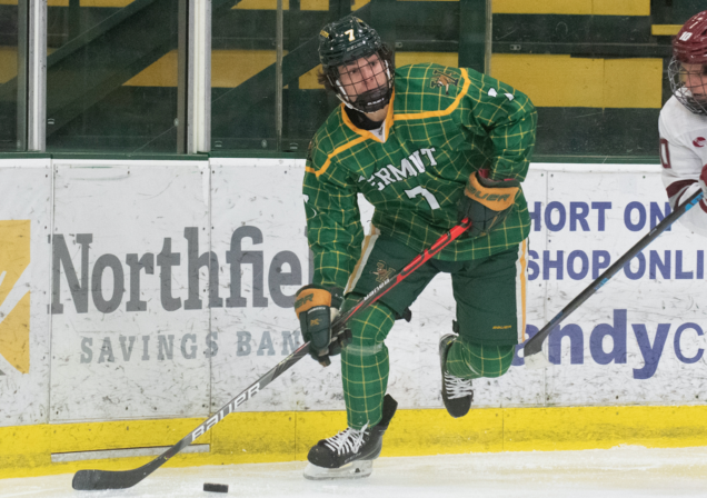
This jersey is fun. Not only do the Catamounts use plaid across the top, but they double-down on the socks as well! However, at the end of the day it’s a gimmicky style to spice up the rotation, and not exactly a jersey you’d want to see on a regular basis. Good effort though!
#7 Providence
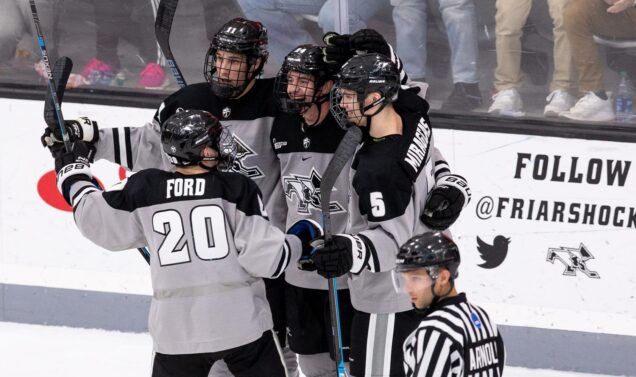
Providence has three colors — “colors” — with black, white, and gray. They already used black, and they already used white, so this one had to be gray, and I think it’s the worst look they have. The logos and black shoulders are fine, but I can’t get past the uninteresting expanse of gray.
#6 Holy Cross
Ehhh… I see what Holy Cross tried to do here, but purple just isn’t the color to pair with black. I don’t mind the design, and I’d probably love it with the colors arranged differently, but the way they have it right now just doesn’t work for me. Again though, I do love that logo on the chest.
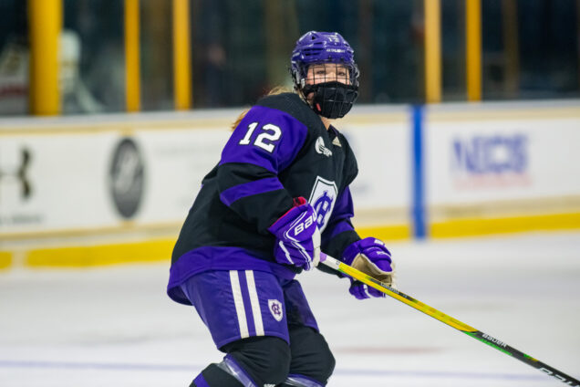
#5 UConn
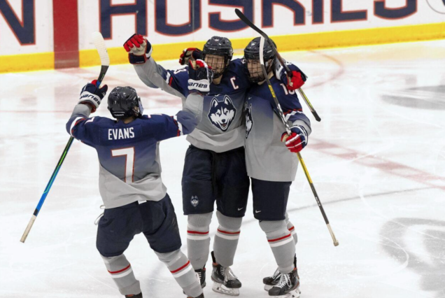
Using a gradient on a hockey uniform is definitely aggressive, but UConn embraces it, wearing this alternate all the time. I don’t love it as much as they do, but as far as gradients go, I think you could do far worse. They finally decided to use the Husky logo here, which I appreciate.
#4 Northeastern
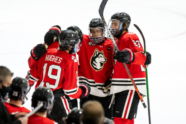
Northeastern came so, so close to having an elite alternate jersey here, and then they decided to surround the chest logo with this awful tan or gold or whatever that is. Why?! The combo of red, white and black looks good throughout the uniform, but that ugly logo outline ruins it all.
#3 Boston College
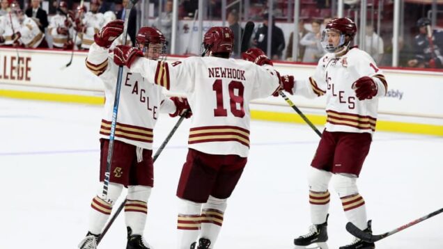
This look has grown on me since they first debuted it, but I’m still not totally in love with it. The thin stripes aren’t visually-pleasing to me, although I know that’s part of the “throwback” feel. I do think they balanced their three colors well, and I like the diagonal lettering on the front.
#2 Boston University
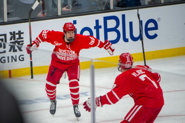
BU doesn’t wear these often, but when they do… oh man. There’s so much red (again, scarlet?) but it works, especially with the white jumping off the base. I also think just adding “University” under “Boston” on the chest makes a huge difference. It’s a simple but awesome third jersey.
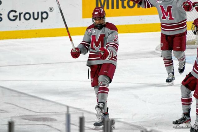
#1 Merrimack
Woah! The Warriors wear their yellow uniforms a ton, as they should. This bright base is complemented well with the blue throughout the ensemble, along with the white accents. They sometimes switch around the logos, and you really can’t go wrong either way. Nicely done!
That’s everyone, but we’re not done just yet! To conclude the series, here are the combined rankings based on where each team ended up on the home, away, and alternate lists. For the schools without an alternate jersey, I’ll just average their previous two ranks to give them a third.
Format — School: home rank, away rank, alternate rank or previous average = average of all three
12) UNH: 11, 12, 11.5 = 11.5
11) UMass Lowell: 10, 7, 13.5 = 10.17
10) UConn: 12, 9, 5 = 8.67
9) UMass: 6, 10, 9 = 8.33
8) Vermont: 8, 8, 8 = 8
T6) Holy Cross: 2, 11, 6 = 6.33
T6) Providence: 7, 5, 7 = 6.33
5) Boston University: 9, 4, 2 = 5
4) Boston College: 3, 6, 3 = 4
3) Maine: 5, 1, 3 = 3
2) Northeastern: 1, 3, 4 = 2.66
1) Merrimack: 4, 2, 1 = 2.33
So there you have it, my final cumulative Hockey East jersey rankings! I hope you enjoyed this series, and if you’d like to share your opinions, you can find me on Twitter @BradyDGardner.