Infomediation and…Ice Cream?
In the following NodeXL graph, 5,275 Twitter users all used the term “baskin robbins” or replied to or were mentioned in a tweet with that term used. The gallery graph gives us a lot of information not only about the users in the data collected but also the top hashtags and URLs used in the tweets shown. The edges show strong connections in each part of the network, and the nodes are, on average, clustered in tight circles.
There is clearly a brand clusters quality to this topic, but I believe it more strongly represents community clusters. This makes sense based on the writings of Smith et al, because people from the same community would be discussing a specific ice cream brand more than a broad network would be, unless there were a national conversation or PR-related event that dramatically improved or decreased that brand’s reputation. Moreover, aside from a few people, populations generally don’t have super polarizing views on ice cream.
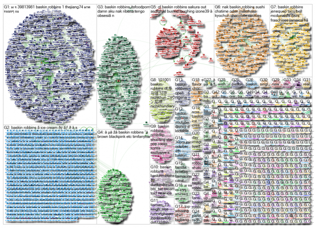
Unlike a political Twitter feed, the graph shows a slight variation of topics/opinions but no drastic differences. This is seen even more strongly when examining the topics discussed. Those topics include Baskin Robbin’s new Halloween Oreo flavor, a local grand opening, a coupon for buy-one-get-one and the October flavor of the month. The people tweeting don’t necessarily know each other, and because the business works from a franchise model, there is a good chance they are located around the globe. But they are coming together in similar form.
This kind of information would/should make Baskin Robbins happy, as it means that there are real people hyping up promotions that their marketing department has put in place. It’s tangible data showing that the company’s influence is working successfully. Presumably, this is exactly what the ice cream store wants: people casually talking about their product, especially as new flavors and deals come out this month. This information isn’t doing anything to change the media landscape, as Rainie and Wellman suggest, but it does exist on a platform where many citizens turn for news and updates. This graph is a good example of how user-generated content is changing the media landscape. As Smyrnaios mentions in Chapter 4, while Twitter wasn’t one of the main players at first in the digital media landscape, it is now a go-to infomediary, along with Facebook and Snapchat.
The NRA on the Kavanaugh Hearings
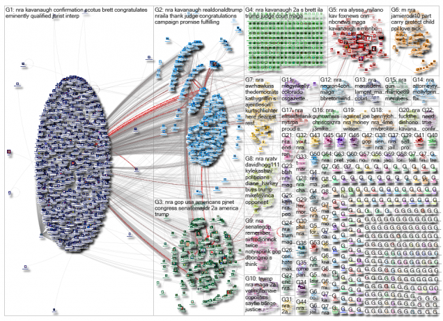
Conversely, the following NodeXL graph represents a support network, as Smith et al refer to it in their article. It has a hub and spoke structure, where the hub account replies to many of the comments of “otherwise disconnected users” (Smith et al, 2014). This makes sense looking at the tweets further, because they all relate to the National Rifle Association, or NRA. So the NRA would be the main, active account in this situation. It looks like most of these tweets relate to Judge Kavanaugh’s confirmation to the Supreme Court, with top hashtags including: #scotus, #congress, #maga and #usa. There are almost 2,000 more unique edges than in the baskin robbins gallery, but the vertices remain around 5,000.
Most of the tweets include the subject of the NRA’s support of Judge Kavanaugh amidst the controversy of the last few weeks, and all are supportive of his confirmation, sharing links from right-wing new sources like Breitbart and Fox News to support their comments. Smith et al mention how groups they identified as conservative used such links, while liberal clusters relied on mainstream news websites as source material.
I think (and believe that Rainie and Wellman would agree) that the graphs are interesting to compare in terms of a heated issue and a pretty generic topic, showing how easily information is picked up and distributed in specific patterns. People like to promote content that supports their own views, as witnessed by the second graph. Many of these accounts are responding to other tweets already published, usually in a supportive manner, while in the basin robbin’s graph gallery, users are tweeting based on an in-person experience they want to share with a crowd. The baskin robbin’s graph is an example of information sharing as more of a public service announcement than for a political purpose — it seems to be agendaless, and hence directionless. I assume that the Twitter users in each gallery have not only different motives for using social media but different mindsets.
As any internet user knows, the web is made up of both kinds of content. User-generated content is both beneficial in terms of collaboration and furthering a sense of community (Rainie & Wellman, 2012) while also potentially problematic, as it might lead to the spread of misinformation. Regardless, it serves as an important platform for users to share their points of view that can (and have) had larger political and economic impacts on society.
Citations
Baskin robbins_2018-10-08_07-06-46.xlsx. (2018, October 08). Retrieved from https://nodexlgraphgallery.org/Pages/Graph.aspx?graphID=170696
Nra_2018-10-07_14-29-56.xlsx. (2018, October 08). Retrieved from https://nodexlgraphgallery.org/Pages/Graph.aspx?graphID=170630
Rainie, L., & Wellman, B. (2012). Networked, The New Social Operating System. Cambridge, MA: The MIT Press.
Smyrnaios, N. (2017). Internet Oligopoly, The Corporate Takeover of Our Digital World (A. Karatzogianni, Ed.). Emerald Publishing.