Accessibility Best Practices
BU’s WordPress themes provide a platform that complies with University Website Policy as well as our Minimum Web Accessibility Standards. It is the responsibility of individual website editors and administrators to maintain this commitment by publishing accessible content when you add and edit pages on your sites.
10 Essential Tips to Maintain Accessible Content
Use relevant headings and semantic HTML to structure content.
- WHY THIS MATTERS
- Headings aren’t just visual style — they’re how assistive software helps low-vision visitors navigate your content. Better, more relevant headings are the #1 fix screen-reader users ask for on web pages. Bold text alone doesn’t create a heading from an accessibility standpoint; you need the actual HTML heading tag.
- WHO BENEFITS
- Screen-reader and low-vision users benefit most directly, since they rely on headings to navigate and understand your page’s structure. Search engines also reward you: proper heading tags carry extra “search weight,” boosting your SEO. And AI agents that read and process your content benefit too — semantic structure with correct tags helps them understand what you’ve written.
- HOW TO DO IT
- In WordPress simply highlight your text in the editor and choose the heading level from the formatting dropdown. Use headings to mark natural breaks in your content, with relevant keywords and titles at 60 characters or fewer. Use HTML paragraphs, bulleted lists, numbered lists, blockquotes, and other elements as they’re intended — not just for visual effect.
-
- Themes already use your page or banner title for the Heading 1 (<h1>), so your content headings should start at Heading 2 (<h2>) and follow hierarchical order (don’t skip from Heading 2 to a Heading 4, for instance).
- Apply formatting semantically — paragraphs as paragraphs, lists as lists, and so on.
- Avoid using <div> and <span> tags for content organization.
- Don’t apply heading format to large blocks of text just to get bold, large type — create a style instead.
- Don’t use images for headings.
Use unique, descriptive, actionable text for links and buttons.
- WHY THIS MATTERS
- Link text needs to stand on its own. Assistive software can pull up a list of just the links on a page — a key navigation tool for low-vision visitors — so if your links all say “click here” or “learn more,” that list becomes meaningless. Good link text is the #2 issue screen-reader users flag most often on web pages.
- WHO BENEFITS
- Screen-reader and low-vision users benefit most directly, since descriptive links let them navigate your site without reading surrounding context. Search engines benefit you in turn: algorithms give added “search weight” to words in link text, boosting your SEO. AI agents that process your content also understand it better when your links are descriptive.
- HOW TO DO IT
- Write links and buttons — inline text and buttons alike — with unique, descriptive, actionable language:
-
- Use descriptive terms that make sense out of context.
- Use actionable terms and verbs.
- Use relevant keywords.
- Don’t use “here,” “click here,” or “learn more” as your link or button text.
- If your audience genuinely needs simpler cues (very young users, older users, or others who benefit from explicit instruction), work “click here” into a full phrase and make the entire phrase the clickable link — not just those two words.
Use 'Alternative Text' attribute to describe images.
- WHY THIS MATTERS
- Assistive software reads your Alternative Text aloud to describe images for low-vision visitors — it’s their only way to know what an image conveys. This matters most for images that carry real information, like infographics. Alt text is the #3 issue screen-reader users flag most often on web pages.
- WHO BENEFITS
- Low-vision visitors benefit most directly, since alt text is how assistive software conveys an image’s content and purpose to them. Search engines and AI agents benefit too — detailed alt text makes your images more discoverable and easier for both to process.
- HOW TO DO IT
- Use the Alternative Text attribute to describe what each image conveys to sighted visitors:
-
- Describe the image’s contents — names, locations, and any action taking place.
- Avoid images with overlaying text when possible. If your image does include text, work the relevant parts into your description.
- For images used as links, phrase your alt text clearly so visitors know the image is clickable.
- Leave alt text empty only when an image is purely decorative.
- In BU WordPress: enter your description in the “Alternative Text” field when you upload the image. That description generates accessible code wherever you embed the image later.
- Use the Web Accessibility Initiative’s alt Decision Tree if you need help deciding when and how to describe an image.
Use tables for tabular data and not for content layout.
- WHY THIS MATTERS
- Assistive software struggles with HTML tables — content can be read out of order and stop making sense to the visitor. Screen readers also announce how many rows and columns a table contains before reading it, which pulls the visitor out of the natural flow of the page. Using tables only for genuine tabular data — where you need to show relationships between rows and columns — keeps that disruption to a minimum.
- WHO BENEFITS
- Screen-reader users benefit most directly, since well-structured tables — or the absence of unnecessary tables — keep content readable and in order. Every visitor benefits indirectly too: avoiding tables for layout keeps your page content flexible and responsive across device sizes.
- HOW TO DO IT
- Use an HTML table only when you need to show row/column relationships in tabular data — never for page or content layout.
-
- Always use headers for your rows and columns. In HTML, use <th> tags instead of <td> tags to to mark a cell as a header.
- For complex tables with relationships between multiple cells, use the HTML ‘scope’ attribute.
- Follow WebAIM’s table techniques to keep your tables accessible.
- In the WordPress editor: the visual editor handles basic table content and row/column edits easily. But marking cells as headers — along with advanced techniques like scope and captions — requires manually editing the text/HTML view.
Use a publishing platform that supports accessibility.
- WHY THIS MATTERS
- Accessibility isn’t something you bolt on after the fact — it needs to be built into the systems you use to edit and publish content. Choosing a content management system with accessible publishing tools makes it far easier to maintain accessible content consistently, rather than fixing issues page by page.
- WHO BENEFITS
- All your visitors benefit, since accessible platforms tend to be modern and responsive by design — meaning your content works better across device sizes, is more discoverable by humans and AI agents, and is more usable overall. Visitors using assistive technology benefit most directly, since the platform itself supports accessible publishing from the ground up.
- HOW TO DO IT
- Build accessibility into your publishing workflow, not just your content:
-
- Learn how to publish accessible content on the web — use the resources here to get started.
- Adopt accessible content procedures as part of your regular publishing workflow.
- Use an accessible content management system and site design, like Responsive Framework, BU’s platform for WordPress websites.
- If you’re not using a content management system, learn how to implement accessible content publishing strategies manually in your HTML.
Ensure content can be accessible via a keyboard alone.
- WHY THIS MATTERS
- Some visitors can’t use a mouse, trackball, or trackpad at all — due to disease, birth defect, injury, or repetitive stress — and rely entirely on a keyboard to navigate your site. They use TAB and ARROW keys to move through a page and SPACEBAR and ENTER to interact with forms and selection elements. If your content isn’t built with keyboard navigation in mind, it can become inaccessible to them entirely.
- WHO BENEFITS
- Keyboard-only users benefit most directly, since logical tab order and keyboard-accessible interactions are often their only way to navigate and use your page. Visitors with temporary mobility limitations — from a broken arm to a repetitive stress injury — benefit too, since anyone can end up relying on a keyboard alone.
- HOW TO DO IT
-
- Ensure your content’s tab order follows a logical progression.
- Provide a “skip to main content” link at the top of each page, so keyboard-only users don’t have to tab through your entire navigation menu first. (This is automatically included in BU WordPress themes.)
- Include anchor links (a jump menu) at the top of long content pages.
- Don’t rely on mouseover actions for access to content or functionality — neither screen readers nor keyboard-only users can trigger them.
Keep your content clean and free of distractions.
- WHY THIS MATTERS
- Accessibility isn’t only about physical challenges. Visitors with attention deficit disorders, learning disorders, or past brain injuries can struggle to comprehend content that’s overly complex or presented in a distracting way. Clear, concise content in a clean design removes barriers that have nothing to do with vision or mobility.
- WHO BENEFITS
- Visitors with learning or cognitive disabilities benefit most directly, since predictable, distraction-free design and clear language make your content easier to comprehend. Really, every visitor benefits — clean design and concise language make content easier for anyone to read and understand.
- HOW TO DO IT
-
- Use a clean site design. Don’t overuse purely decorative images and graphics, and avoid blinking, moving, or animated text.
- Publish content that appears and functions in predictable ways.
- Use easy, clear, concise language wherever complexity can be avoided.
- Help users avoid mistakes — for example, use selection menus rather than open fields on web forms where appropriate.
- Organize your content into distinct, digestible sections that are easy to read and understand.
Provide captions for videos and transcripts for audio content.
- WHY THIS MATTERS
- Video content is one of the most effective ways to reach visitors, and it’s easier than ever to produce and publish. But as multimedia use on the web keeps growing, so does the need to make it accessible — visitors with hearing impairments need captions, and audio content like podcasts needs a text transcript to be usable at all.
- WHO BENEFITS
- Visitors with hearing impairments benefit most directly from captions and transcripts. Non-native speakers of a video’s language also benefit significantly from captions. And your whole site benefits from the SEO boost transcripts provide, since they make multimedia content far easier to discover.
- HOW TO DO IT
-
- Provide captions — equivalent text content of the spoken word — with all multimedia content.
- Synchronize captions so the text appears at the same time as the audio.
- Provide transcripts for both video and audio content. Video transcripts should include additional explanatory descriptions beyond just the spoken word.
Create forms that are accessible.
- WHY THIS MATTERS
- Screen-reader users can find web forms especially challenging to navigate. They need to be able to tab through every field — in order — before reaching the Submit button, and each field needs a label descriptive enough to make sense out of context.
- WHO BENEFITS
- Screen-reader users benefit most directly, since intuitive tab order and descriptive labels are often the only way they can complete a form successfully. Keyboard-only users benefit too, since logical tab order matters just as much when a mouse isn’t part of the equation.
- HOW TO DO IT
-
- Use appropriately positioned, descriptive form field labels. For example, don’t use “Name” — use “Full Name,” or separate “First Name” and “Last Name” fields.
- Make sure visitors can tab through all form fields before reaching the Submit button.
- Group related form fields together using fieldsets.
- Indicate required fields in an accessible way — don’t rely on color or an asterisk alone.
- Use the “Field Label” function in Gravity Forms to clearly describe each field.
- Don’t place any fields after the Submit button (Gravity Forms sets tab order based on the order fields are entered in the form builder).
Use color appropriately and with care.
- WHY THIS MATTERS
- Nearly 10% of the population has some form of color blindness or color deficiency, most commonly red-green. These visitors can struggle with low-contrast color combinations or with distinguishing certain colors from one another — so information conveyed by color alone may not reach them at all.
- WHO BENEFITS
- Visitors with color blindness or other color deficiencies benefit most directly from appropriate contrast and non-color cues. Visitors with low vision benefit from strong contrast too, and everyone benefits from clearer, easier-to-scan content.
- HOW TO DO IT
-
- Avoid color combinations known to be problematic for color blindness — red-green combinations especially.
- Use visual indicators in addition to color to convey information, such as labeling colors with numbers or symbols and providing a corresponding key.
- Avoid low-contrast combinations like red and black, or white and gray.
- Use online tools to evaluate your color contrast.
Evaluating Webpage Accessibility in BU WordPress
Web editors using BU WordPress have a link in the editor on every page to run an accessibility evaluation. This submits the page to WAVE: Web Accessibility Evaluation Tool and provides a report for that page.
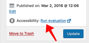
This tool can only check accessibility requirements that can be verified in an automated fashion.
- For example, it can alert if an ALT attribute is not entered for an image, but it cannot ensure that ALT attributes are truly descriptive and relevant.
- Also for example, the tool cannot ensure that you are using actionable words for your links and not using context-less phrases like “click here.”
Automated tools cannot test everything — it remains the responsibility of all BU web editors to be familiar with web accessibility basics and to use them consistently when you add and maintain web content.
WAVE also provides native browser extensions for some popular web browsers. Some users find the browser extension to be better for their workflow than the web-based version.
More Accessibility Resources
The web has a wealth of accessibility resources available. Here are a few of the best:
What About ARIA?
ARIA (Accessible Rich Internet Applications) is a W3C specification that provides attributes (roles, states, and properties) you can add to HTML to convey semantic meaning to assistive technologies — particularly for dynamic content and custom interface components that native HTML doesn’t have built-in support for.
Nearly everyone working with standard content in the BU theme on a WordPress site is using semantic HTML elements and does not need to use ARIA in your workflow.
If you are copying/pasting content from another digital source, you should delete any ARIA attributes from your HTML code. From an accessibility perspective, no ARIA is better than bad ARIA. The practical decision process should be:
- Use semantic HTML first.
- Only use ARIA when semantic HTML can’t do the job.
- When using ARIA you’re also responsible for the javascript (keyboard interaction, focus management) that makes the ARIA role or state meaningful.
The BU theme in WordPress uses ARIA sparingly, as a supplement — not a substitute — for semantic HTML.
When ARIA is genuinely necessary.
- Custom widgets without equivalent HTML elements – this can include tabs, accordions, comboboxes, modal dialog boxes, tree views, sliders typically built with <div> and <span> tags.
- Dynamic content – this can include things like form validation errors, status updates without page reload, etc. Screen readers won’t announce a DOM change unless prompted to do so.
- States not visually obvious in code – this might include collapsible menu buttons, custom checkboxes, etc.
- Relationships not expressible with HTML alone – for instance, linking a form field to help text when a visible label isn’t structurally connected via a <label> tag.
- Landmark clarification – for instance, reinforcing regions when semantic tags alone leave ambiguity, although native elements such as <nav>, <main>, <search>, etc., are preferred.
When ARIA is *not* necessary - and often harmful.
- When using native, semantic HTML elements correctly, you don’t need ARIA roles on top of them; for instance adding role=”button” to an actual <button> is redundant at best.
- Misused ARIA is worse than no ARIA. Slapping “aria-label” on things indiscriminately, or adding roles without the required keyboard behavior and state management to back them up, actively breaks the experience — screen reader users get promised functionality that doesn’t exist. This is often summarized as “no ARIA is better than bad ARIA.”
- Don’t override native semantics unnecessarily. For instance, adding ARIA role=”presentation” to a <table> that contains actual tabular data would remove the very information that assistive technology requires.